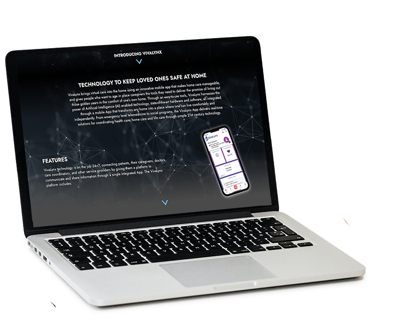
Vivalynx Website Design

Challenge
Vivalynx creates technology that helps provide home care for seniors by connecting them with family and caregivers. They needed a B2B focused site that explains what the company does with a focus on technology.
My Role
I worked as the web designer on this project. I worked with a developer and a sales team to create and determine the content and organization of the site.

The Process
We created several different concepts for the website. The client wanted a modern, high-tech look that clearly communicated what the company does. We focused primarily on a desktop design rather than mobile, as this is a B2B site that was more likely to be viewed on desktop.
The top concept was the most straightforward—working with the clients current colors and a large stock photo, overlayed with an image of their app and some text. The second concept used a dark color scheme and some more abstract, textures chosen to add a more high-tech feel. Concept 3 was more abstract. I came up with the idea to show a map demonstrating the connection between seniors and family members despite physical distance. The client chose concept 3.
 >
>
The Design
We settled on a design that was primarily one-page. Visitors can scroll down to learn more about the company on different sections of the website.
Homepage Hero Animation
I created this animation for the hero of the website in After Effects and exported it as a Lottie file for use on the site. This allows the animation to be a small file size and adjust for different screen widths. Below, I’ve shown how the animation looks on the live site including the background image behind it.