Lapland Lake Branding

Challenge
Lapland Lake is a vacation center in the Adirondacks that offers cross country skiing in the winter and lakeside vacations in the summer. They needed a new logo and brand identity that would represent both seasons and appeal to their main target audience–families looking for a relaxing vacation.
My Role
I worked as the designer on this project, working with the owners on a freelance basis to create a design.

The Logo
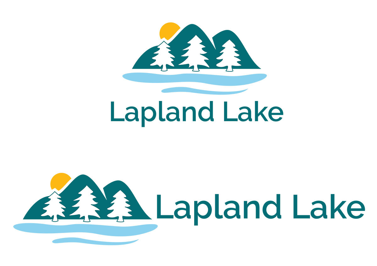
For the logo design, I represented winter with white pine trees similar to the ones at Lapland Lake. I represented summer with green mountains and lake water beneath them. I wanted to make sure to use organic, hand drawn shapes to create the logo rather than harsh geometric ones. The logo needed to feel soft and inviting, as the resort is more focused on relaxing, fun getaways than intense sports. I created a vertical and horizontal version of the logo.
 >
>The Brochure
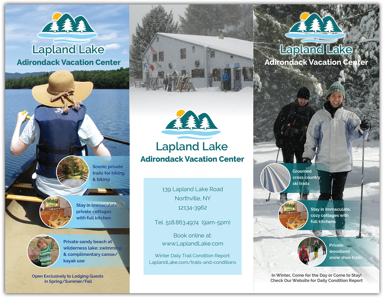
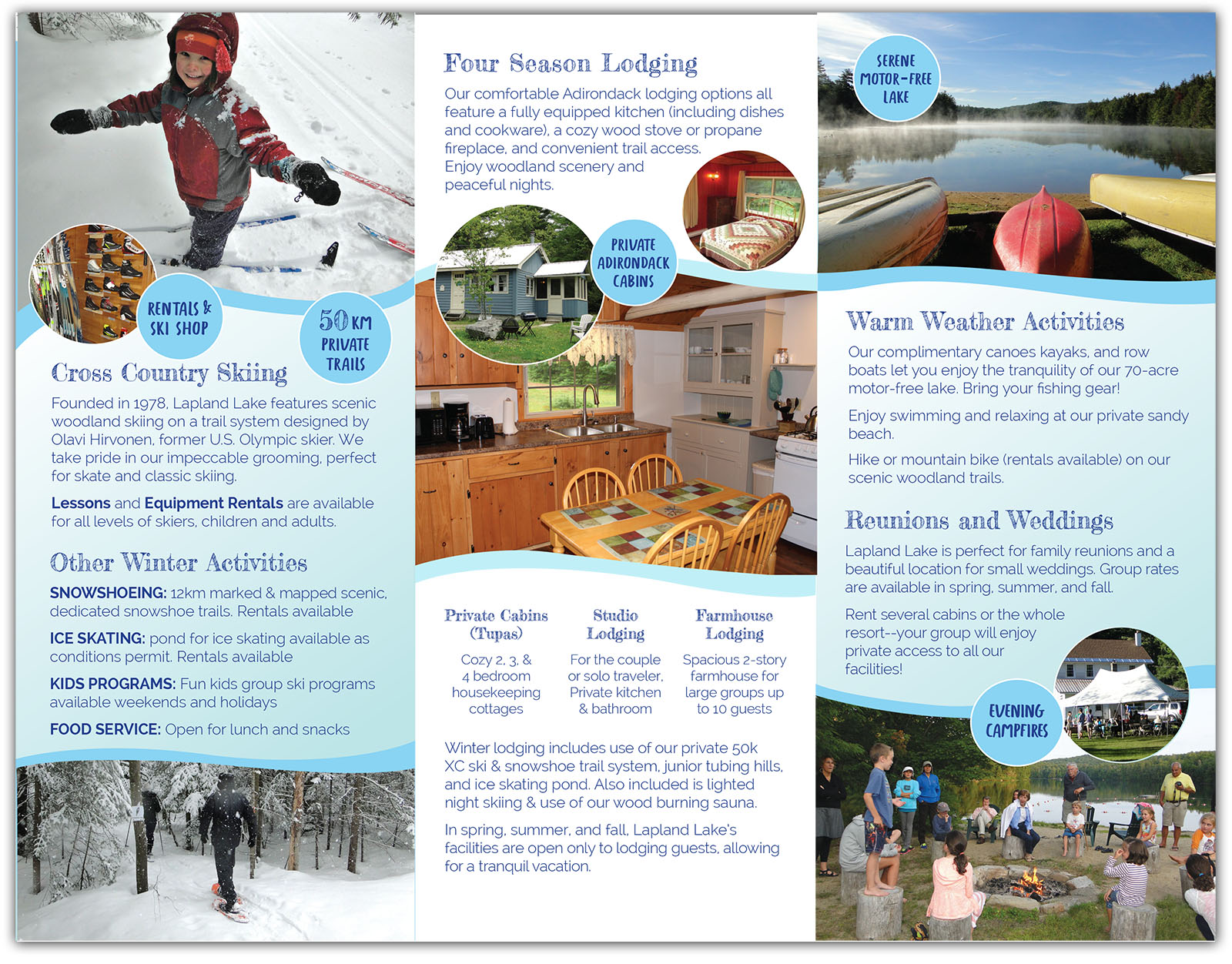
After creating the logo, I designed a brochure. Shown here are the inside and outside of the brochure. It was important to incorporate the colors of the logo. I used waving, organic lines and a fun type face to capture the fun, family friendly feel of the resort. the brochure has two covers, one for summer and one for winter. So when the brochure sits on a rack, the cover matching the current season can be shown in front. Click the brochure images to see them larger.

