Florist Shopping App
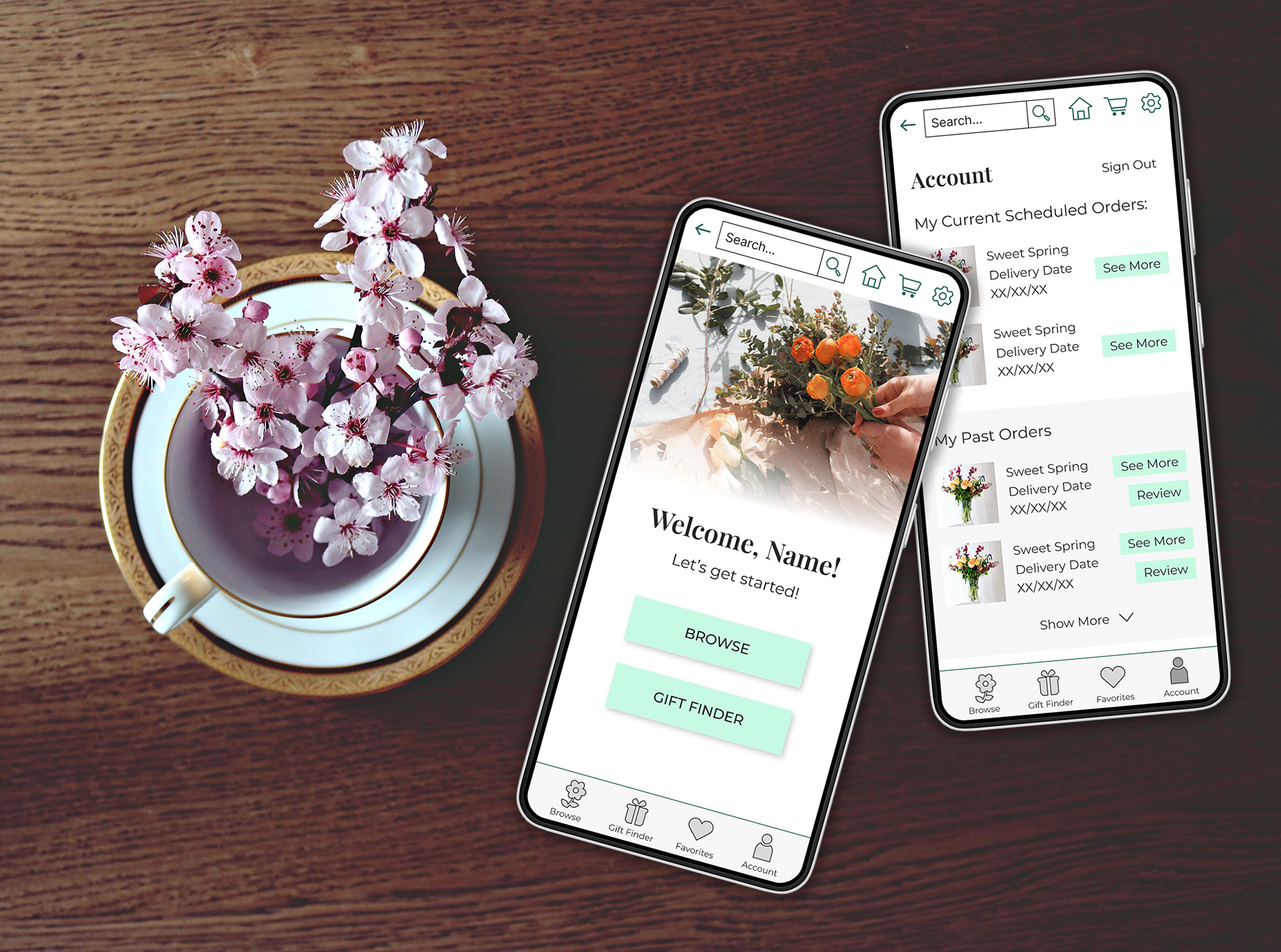
Challenge
This conceptual project involved creating a dedicated mobile shopping app for a florist. Customers ordering flowers online may feel unsure of what they’re looking for and want a quick way to get recommendations for their specific needs.
My Role
My Role: As UI/UX designer and researcher, my tasks included UX research, competitive audit, ideation, wireframes, low fidelity prototypes, usability study and fully designed mockups and prototypes.

Understanding The User
The first step was to consider who user for this product would be and what their needs and pain points are. I created two personas of different potential users and considered their journeys.
“Jessica” represents a busy professional who wants to impress friends and family with great gifts, but doesn’t have much time or know where to start. She wants a simple ordering process and an easy way to get recommendations that fit within her budget and are perfect for each occasion.
“Sarah” is a shop owner who regularly orders arrangements for her business. She’s looking for options to choose the perfect arrangement to fit the season and her shop’s aesthetic, and she needs to do it on a budget. She wants to be able to save favorite arrangements to reorder.
Competitive Analysis:
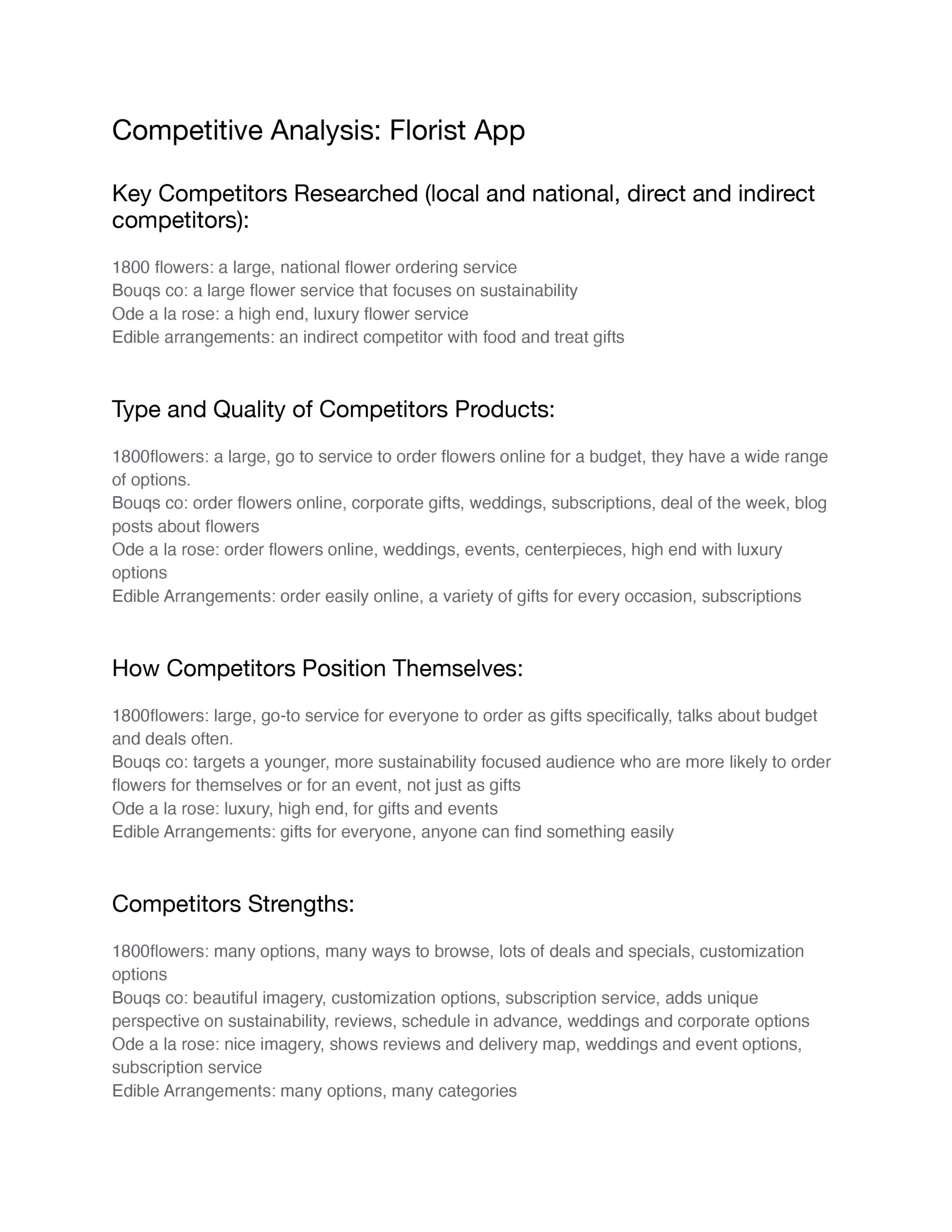
I analyzed a variety of direct competitors, from large national flower chains to smaller scale flower shops, as well as some indirect competitors such as Etsy and apps for other types of gifts.
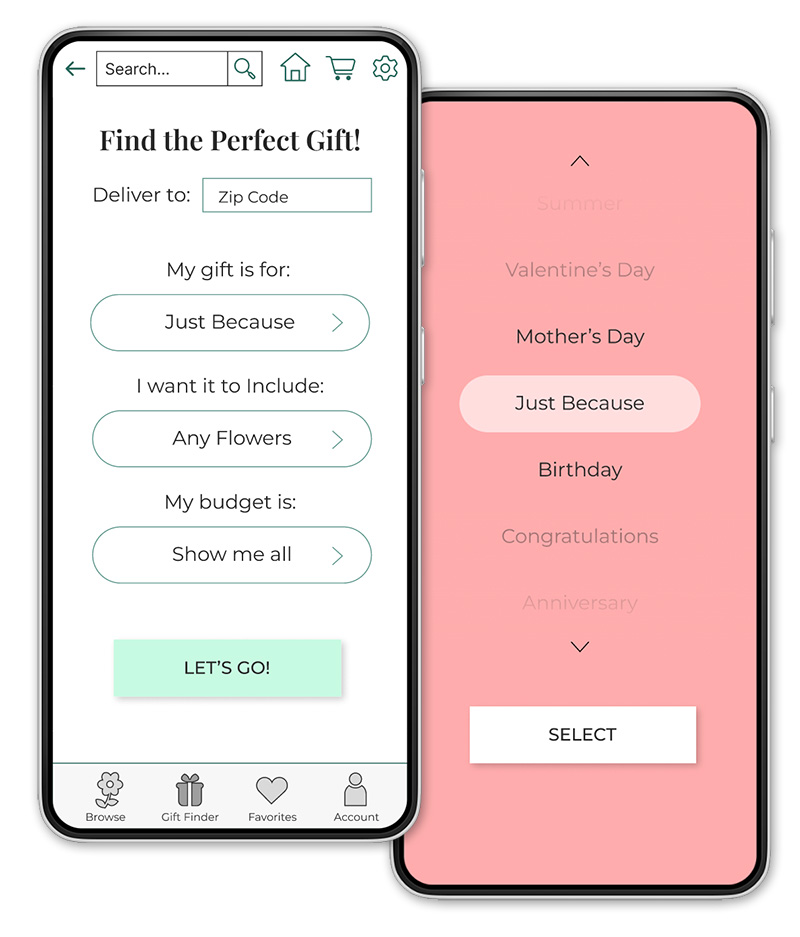
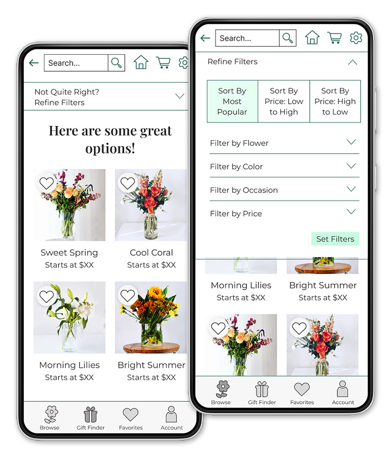
Many online florists have some type of gift finder tool, but if often only asks which occasion someone is shopping for and doesn’t offer enough specific options. The filters when browsing were often confusing. I wanted to include a gift finding tool that gave someone many options to choose from to get the best recommendations. But some users aren’t looking for gifts or prefer to simply browse rather than get recommendations. Those users need clear search filters and sort by options to find exactly what they’re looking for.
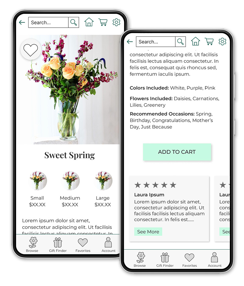
Another gap in the offerings of other florist apps was the lack of ability to favorite and save arrangements for later. I wanted to make sure it was easy to save favorites, look at past orders, and reorder them to make the process as simple as possible. Click the image to see a pdf of the analysis.
Wireframes and Low Fidelity Prototypes
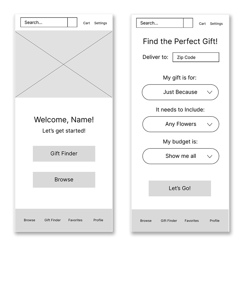
I started brainstorming ideas for layouts and flows of the app and came up with some wireframes. To address user needs, the wireframes include features like a prominent search bar, bottom navigation, and clear filters to search and sort by. I developed these a bit further and turned them into low fidelity prototypes. I created these in Figma and set up every screen in the app so that someone could click through the whole flow.
Usability Study:
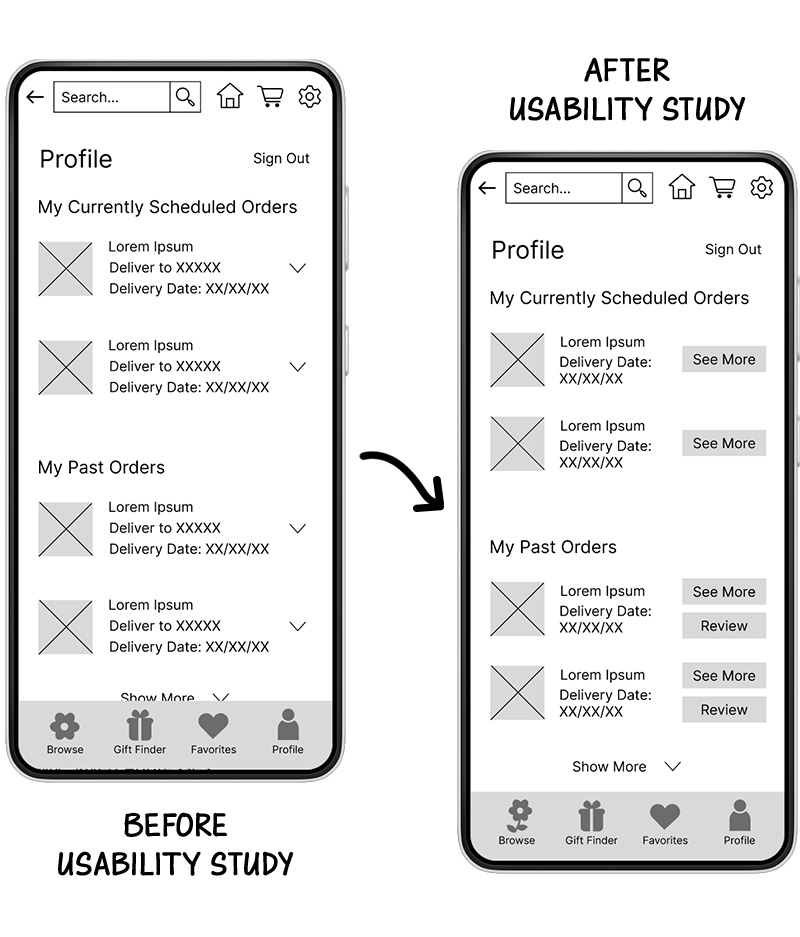
The next step was to take my low fidelity prototype and complete a usability study. I asked 5 people to complete a series of tasks, including shopping for an arrangement and placing an order, favoriting an item, and reordering a previous order.
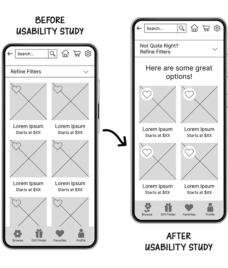
I got some useful feedback from the study. For example, several people were unable to spot the “favorite” heart and were confused about some of the reorder options. Several people also mentioned that they would like to see reviews.
I made some changes to make some of the buttons easier to spot, redesigned some of the icons to be clearer, and added reviews to each product.
High Fidelity Profile
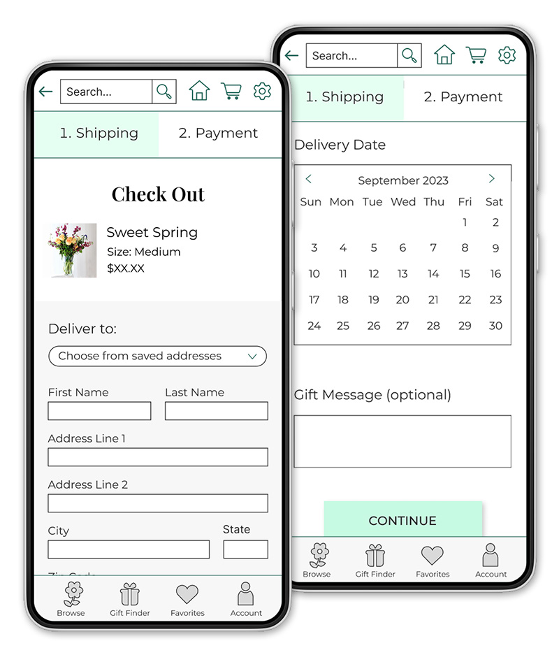
After making the changes, I fully designed the app to create high fidelity mockups and prototypes. I wanted a sleek, clean design that still had a personality that fit with a florist shop. Highlighting sleek, clean, product photography was important.
On a follow up usability study, participants were much happier with the app after the changes. I made a few adjustments to some icons and the position of some elements based on some comments, but people were overall happy with the experience and design.
Takeaways
I learned a lot about UX research from this project. Doing plenty of research on users and competitors helped me to think of new ideas. The usability study was extremely helpful. I made a lot of improvements based on that. I learned that not every user approaches an app the same way, and making sure that how to complete all tasks is clear is very important.
test